Highlight Points Inside a Certain Radius
Cristian E. Nuno
December 22, 2017
Introduction
After plotting points and polygons, it is useful to understand how to identify coordinate pairs within a specific distance from one particular coordinate pair.
Refresher on Calculating Distance
 Image Courtesy of Wiki Media Commons
Khan Academy’s Distance Formula article is an excellent refresher on how to find the distance between two points using the Pythagorean theorem:
This formula is used to calculate the distance of a line segment on a flat surface - such as the two-dimensional Cartesian plane shown above. A friendly reminder that all Khan Academy content is available for free at www.khanacademy.org.
Distance Between Two Geographic Points
Despite what Kyrie Irving - 2016 NBA Champion - and other flat-earthers might say, Bill Walton - 1977 & 1986 NBA Champion - and NASA are here to help set the record straight.
Calculating the shortest distance between two points on Earth needs to take into the curvature of the Earth.
 ]
]
Image courtesy of NASA
Thanks to the field of geodesy - the study of the size and shape of the Earth - it is easy to account for the curvature of the Earth using the geosphere R package.
Data Preparation
Data Source
This examples uses Chicago open data, specifically two data sets:
## import packages ##
library( sp )
library( rgdal )
library( geosphere )

# import chicago current community area url
geojson_comarea_url <- "https://data.cityofchicago.org/api/geospatial/cauq-8yn6?method=export&format=GeoJSON"

# transform vector into spatial dataframe using the rgdal::readOGR() function
comarea606 <- readOGR( dsn = geojson_comarea_url
                       , layer = "OGRGeoJSON"
                       , stringsAsFactors = FALSE
                       , verbose = FALSE
)
## Warning in normalizePath(dsn): path[1]="https://data.cityofchicago.org/
## api/geospatial/cauq-8yn6?method=export&format=GeoJSON": No such file or
## directory
## Warning in normalizePath(dsn): path[1]="https://data.cityofchicago.org/
## api/geospatial/cauq-8yn6?method=export&format=GeoJSON": No such file or
## directory
## Warning in normalizePath(dsn): path[1]="https://data.cityofchicago.org/
## api/geospatial/cauq-8yn6?method=export&format=GeoJSON": No such file or
## directory
## Warning in normalizePath(dsn): path[1]="https://data.cityofchicago.org/
## api/geospatial/cauq-8yn6?method=export&format=GeoJSON": No such file or
## directory
## Warning in normalizePath(dsn): path[1]="https://data.cityofchicago.org/
## api/geospatial/cauq-8yn6?method=export&format=GeoJSON": No such file or
## directory# import cps school data for SY1617
cps.sy1617.url <- "https://data.cityofchicago.org/api/views/8i6r-et8s/rows.csv?accessType=DOWNLOAD"
# transform URL into a data frame using the base `read.csv` function
cps.sy1617 <- read.csv( file = cps.sy1617.url
, header = TRUE
, stringsAsFactors = FALSE
)
# store Walter Payton HS lon & lat in a data frame
wp.coord <- data.frame( School_Longitutde = cps.sy1617$School_Longitude[ which( cps.sy1617$Long_Name == "Walter Payton College Preparatory High School" ) ]
, School_Latitude = cps.sy1617$School_Latitude[ which( cps.sy1617$Long_Name == "Walter Payton College Preparatory High School" ) ]
)
# calculating distance of other CPS schools
# from Walter Payton HS
cps.sy1617$distance.from.wp <- distGeo(
p1 = wp.coord
, p2 = cps.sy1617[ c( "School_Longitude", "School_Latitude" ) ]
, a = 6378137 # radius of ellipsoid
, f = 1 / 298.257223563 # flattening the ellipsoid
) / 1609.344 # covert meters to milesplotCircle() function, courtesy of Gregoire Vincke
Thanks to Gregoire Vincke’s answer to the Stack Overflow question Drawing a Circle with a Radius of a Defined Distance in a Map, there is a way to graphically plot a user-specified circle. Vincke does an incredible job and I recommend everyone to read through his source code.
# https://stackoverflow.com/questions/23071026/drawing-a-circle-with-a-radius-of-a-defined-distance-in-a-map
plotCircle <- function( LonDec, LatDec, Mi, line.color ) {#Corrected function
    #LatDec = latitude in decimal degrees of the center of the circle
    #LonDec = longitude in decimal degrees
    #Mi = radius of the circle in miles
    ER <- 3959 # 6371 is the mean Earth radius in kilometers. Change this to 3959 and you will have your function working in miles.
    AngDeg <- seq(1:360) #angles in degrees
    Lat1Rad <- LatDec*(pi/180)#Latitude of the center of the circle in radians
    Lon1Rad <- LonDec*(pi/180)#Longitude of the center of the circle in radians
    AngRad <- AngDeg*(pi/180)#angles in radians
    Lat2Rad <-asin(sin(Lat1Rad)*cos(Mi/ER)+cos(Lat1Rad)*sin(Mi/ER)*cos(AngRad)) #Latitude of each point of the circle rearding to angle in radians
    Lon2Rad <- Lon1Rad+atan2(sin(AngRad)*sin(Mi/ER)*cos(Lat1Rad),cos(Mi/ER)-sin(Lat1Rad)*sin(Lat2Rad))#Longitude of each point of the circle rearding to angle in radians
    Lat2Deg <- Lat2Rad*(180/pi)#Latitude of each point of the circle rearding to angle in degrees (conversion of radians to degrees deg = rad*(180/pi) )
    Lon2Deg <- Lon2Rad*(180/pi)#Longitude of each point of the circle rearding to angle in degrees (conversion of radians to degrees deg = rad*(180/pi) )
    polygon(Lon2Deg
            , Lat2Deg
            , lty = "dotted"
            , border = line.color
            , lwd = 3
            )
}
Mapping
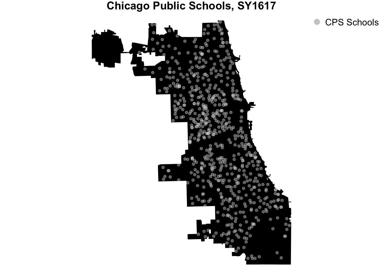
Plotting all CPS schools
The following is a map of all of the city’s public schools.
# set plot parameters
# shrink margins to magnify plot
par( mar = c( 0, 0, 1, 0 ) )

# plot Chicago community area boundaries
# making the fill and borders the same color
# to create a background
plot( x = comarea606
      , main = "Chicago Public Schools, SY1617"
      , col = "black"
      , border = "black"
)

# plot CPS schools in the foreground
# a light gray color
points( x = cps.sy1617$School_Longitude
        , y = cps.sy1617$School_Latitude
        , pch = 20
        , col = rgb( red = 224
                     , green = 224
                     , blue = 224
                     , alpha = 100
                     , maxColorValue = 255
               )
        )

# add legend
# to clarify what's happening on the map
legend( x = "topright"
        , legend = "CPS Schools"
        , col = "#CCCCCC"
        , pch = 20
        , bty = "n"
        , cex = 1
        , pt.cex = 2
        )
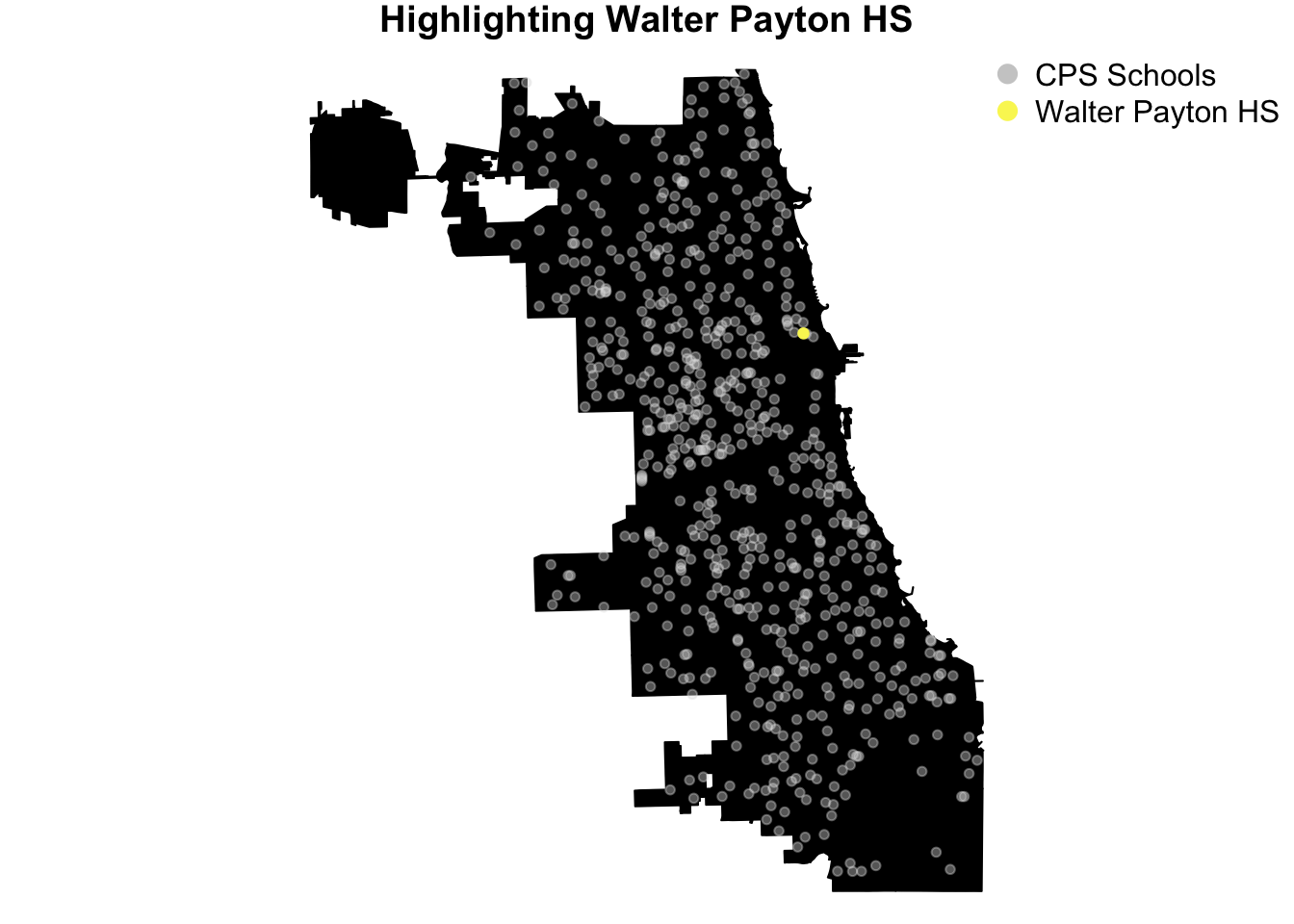
Highlighting Walter Payton High School
Now, let’s highlight Walter Payton High School - named after Sweetness, legendary Chicago Bears’ running back, Walter Payton.
# set plot parameters
# shrink margins to magnify plot
par( mar = c( 0, 0, 1, 0 ) )

# plot Chicago community area boundaries
# making the fill and borders the same color
# to create a background
plot( x = comarea606
      , main = "Highlighting Walter Payton HS"
      , col = "black"
      , border = "black"
)

# plot CPS schools in the foreground
# a light gray color
points( x = cps.sy1617$School_Longitude
        , y = cps.sy1617$School_Latitude
        , pch = 20
        , col = rgb( red = 224
                     , green = 224
                     , blue = 224
                     , alpha = 100
                     , maxColorValue = 255
               )
        )

# replot Walter Payton HS
# this time changing the color to bright yellow
points( x = cps.sy1617$School_Longitude[ which( cps.sy1617$Long_Name == "Walter Payton College Preparatory High School" ) ]
        , y = cps.sy1617$School_Latitude[ which( cps.sy1617$Long_Name == "Walter Payton College Preparatory High School" ) ]
        , pch = 20
        , col = "#F9F561"
        , cex = 1.1
  )

# add legend
# to clarify what's happening on the map
legend( x = "topright"
        , legend = c("CPS Schools", "Walter Payton HS")
        , col = c("#CCCCCC", "#F9F561")
        , pch = 20
        , bty = "n"
        , cex = 1
        , pt.cex = 2
        )
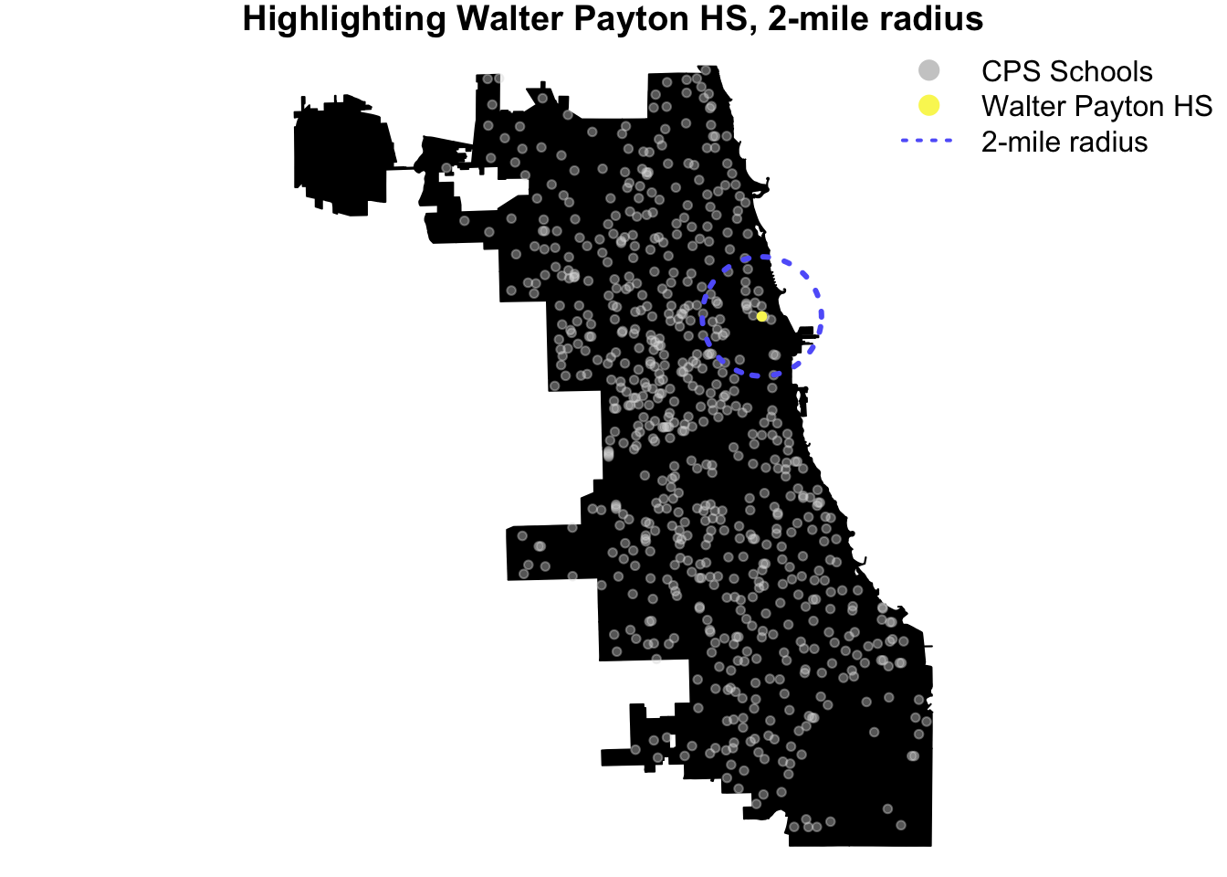
Draw a 2-mile radius around Walter Payton High School
This is where we’ll use Gregoire Vincke’s plotCircle() function, from his answer to the Stack Overflow question Drawing a Circle with a Radius of a Defined Distance in a Map, to draw a 2-mile radius around Walter Payton high school.
# set plot parameters
# shrink margins to magnify plot
par( mar = c( 0, 0, 1, 0 ) )

# plot Chicago community area boundaries
# making the fill and borders the same color
# to create a background
plot( x = comarea606
      , main = "Highlighting Walter Payton HS, 2-mile radius"
      , col = "black"
      , border = "black"
)

# plot CPS schools in the foreground
# a light gray color
points( x = cps.sy1617$School_Longitude
        , y = cps.sy1617$School_Latitude
        , pch = 20
        , col = rgb( red = 224
                     , green = 224
                     , blue = 224
                     , alpha = 100
                     , maxColorValue = 255
               )
        )
# replot Walter Payton HS
# this time changing the color to bright yellow
points( x = cps.sy1617$School_Longitude[ which( cps.sy1617$Long_Name == "Walter Payton College Preparatory High School" ) ]
        , y = cps.sy1617$School_Latitude[ which( cps.sy1617$Long_Name == "Walter Payton College Preparatory High School" ) ]
        , pch = 20
        , col = "#F9F561"
  )

# use the plotCircle() function
# to draw the 2-mile radius around Walter Payton HS
plotCircle( LonDec = cps.sy1617$School_Longitude[ which( cps.sy1617$Long_Name == "Walter Payton College Preparatory High School" ) ]
            , LatDec = cps.sy1617$School_Latitude[ which( cps.sy1617$Long_Name == "Walter Payton College Preparatory High School" ) ]
            , Mi = 2
            , line.color = "#6165F9"
            )

# add legend
# to clarify what's happening on the map
legend( x = "topright"
        , legend = c("CPS Schools"
                     , "Walter Payton HS"
                     , "2-mile radius"
                     )
        , col = c("#CCCCCC"
                  , "#F9F561"
                  , "#6165F9"
                  )
        , pch = c(20, 20, NA)
        , lty = c(NA, NA, "dotted")
        , bty = "n"
        , cex = 1
        , pt.cex = 2
        , lwd = 2
        )
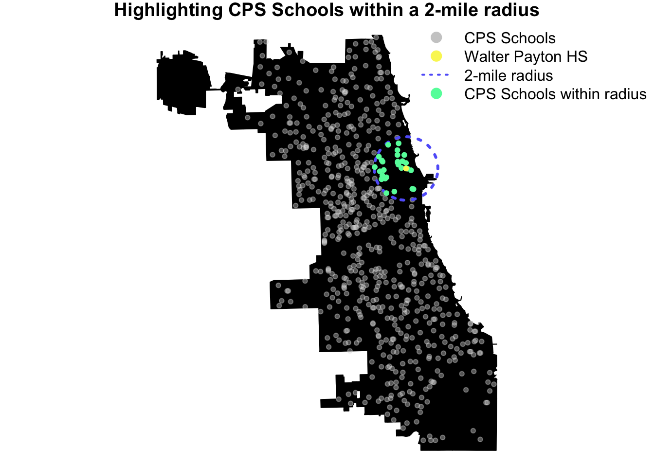
Highlight CPS schools within 2-mile radius of Walter Payton High School
Earlier, we created distance.from.wp variable using the distGeo() function from the geosphere package, by calculating the shortest distance between two points on Earth (or any ellipsoid).
Using the distance.from.wp variable, we change the color to a bright green (HEX #61F9A9) only for those CPS schools whose distance from Walter Payton high school is less than or equal to 2 miles.
# set plot parameters
# shrink margins to magnify plot
par( mar = c( 0, 0, 1, 0 ) )

# plot Chicago community area boundaries
# making the fill and borders the same color
# to create a background
plot( x = comarea606
      , main = "Highlighting CPS Schools within a 2-mile radius"
      , col = "black"
      , border = "black"
)

# plot CPS schools in the foreground
# a light gray color
points( x = cps.sy1617$School_Longitude
        , y = cps.sy1617$School_Latitude
        , pch = 20
        , col = rgb( red = 224
                     , green = 224
                     , blue = 224
                     , alpha = 100
                     , maxColorValue = 255
               )
        )

# replot Walter Payton HS
# this time changing the color to bright yellow
points( x = cps.sy1617$School_Longitude[ which( cps.sy1617$Long_Name == "Walter Payton College Preparatory High School" ) ]
        , y = cps.sy1617$School_Latitude[ which( cps.sy1617$Long_Name == "Walter Payton College Preparatory High School" ) ]
        , pch = 20
        , col = "#F9F561"
  )

# use the plotCircle() function
# to draw the 2-mile radius around Walter Payton HS
plotCircle( LonDec = cps.sy1617$School_Longitude[ which( cps.sy1617$Long_Name == "Walter Payton College Preparatory High School" ) ]
            , LatDec = cps.sy1617$School_Latitude[ which( cps.sy1617$Long_Name == "Walter Payton College Preparatory High School" ) ]
            , Mi = 2
            , line.color = "#6165F9"
            )

# plot CPS schools whose distance from Walter Payton HS
# is no greater than 2 miles.
# Coloring them a bright green
points( x = cps.sy1617$School_Longitude[ which( cps.sy1617$distance.from.wp <= 2 ) ]
        , y = cps.sy1617$School_Latitude[ which( cps.sy1617$distance.from.wp <= 2 ) ]
        , pch = 20
        , col = "#61F9A9"
)

# replot Walter Payton HS
# this time changing the color to bright yellow
points( x = cps.sy1617$School_Longitude[ which( cps.sy1617$Long_Name == "Walter Payton College Preparatory High School" ) ]
        , y = cps.sy1617$School_Latitude[ which( cps.sy1617$Long_Name == "Walter Payton College Preparatory High School" ) ]
        , pch = 20
        , col = "#F9F561"
  )

# add legend
# to clarify what's happening on the map
legend( x = "topright"
        , legend = c("CPS Schools"
                     , "Walter Payton HS"
                     , "2-mile radius"
                     , "CPS Schools within radius"
                     )
        , col = c("#CCCCCC"
                  , "#F9F561"
                  , "#6165F9"
                  , "#61F9A9"
                  )
        , pch = c(20, 20, NA, 20)
        , lty = c(NA, NA, "dotted", NA)
        , bty = "n"
        , cex = 1
        , pt.cex = 2
        , lwd = 2
        )
About Me
Thank you for reading this tutorial. My name is Cristian E. Nuno and I am an aspiring data scientist. To see more of my work, please visit my professional portfolio Urban Data Science.
Session Info
# Print version information about R, the OS and attached or loaded packages.
sessionInfo()
R version 3.4.3 (2017-11-30) Platform: x86_64-apple-darwin15.6.0 (64-bit) Running under: macOS Sierra 10.12.6
Matrix products: default BLAS: /System/Library/Frameworks/Accelerate.framework/Versions/A/Frameworks/vecLib.framework/Versions/A/libBLAS.dylib LAPACK: /Library/Frameworks/R.framework/Versions/3.4/Resources/lib/libRlapack.dylib
locale: [1] en_US.UTF-8/en_US.UTF-8/en_US.UTF-8/C/en_US.UTF-8/en_US.UTF-8
attached base packages: [1] stats graphics grDevices utils datasets methods
[7] base
other attached packages: [1] geosphere_1.5-7 ggmap_2.6.1 ggplot2_2.2.1 rgdal_1.2-15
[5] sp_1.2-5
loaded via a namespace (and not attached): [1] Rcpp_0.12.13 knitr_1.17 magrittr_1.5
[4] maps_3.2.0 munsell_0.4.3 colorspace_1.3-2 [7] lattice_0.20-35 rjson_0.2.15 jpeg_0.1-8
[10] rlang_0.1.4 stringr_1.2.0 plyr_1.8.4
[13] tools_3.4.2 grid_3.4.2 gtable_0.2.0
[16] png_0.1-7 htmltools_0.3.6 yaml_2.1.14
[19] lazyeval_0.2.1 rprojroot_1.2 digest_0.6.12
[22] tibble_1.3.4 reshape2_1.4.2 mapproj_1.2-5
[25] rsconnect_0.8.5 evaluate_0.10.1 rmarkdown_1.8
[28] stringi_1.1.6 compiler_3.4.2 RgoogleMaps_1.4.1 [31] scales_0.5.0 backports_1.1.1 proto_1.0.0
Copyright © 2017 - 2018. Urban Data Science. All rights reserved. See Disclaimer for further details.